
18/7/2025
Importance of typography in UI design
Disclaimer
Sometimes an app feels great or ugly at first glance, often because of its typography.
Good typography makes a product feel clean and polished, while bad typography instantly makes it feel off.
Too many fonts, poor font choices, text that’s too small or too large, poor contrast, and bad spacing all make typography (and the whole UI) harder to read and less appealing.
Apps like McDonald’s, Apple Podcasts, or InPost feel clear and easy to read because their designers followed basic typography rules.

Sometimes, when you open an app, your first thought is:
“Wow, this looks great!”
And then you go to another one and immediately feel like “this just... feels ugly.”
Ever wondered why that happens?
A huge reason for this is… typography.
Typography
Typography is how text is presented - font, size, spacing.
Someone might think: "it’s just text, how important can it be in a product where there’s so much else going on?"
But here’s the thing - typography is key in UI.
Text is everywhere: headings, buttons, descriptions, menus, labels. When it looks good, everything feels “clean” and well thought-out. When it’s poorly planned users immediately sense that something’s off, even if they can’t explain what.
Common typography mistakes in UI design
Many people think typography just means “choosing a font I like.” Unfortunately, it’s not that simple. Typography in UI design is full of rules that are really easy to break if you don’t know them.
Let’s look at some of the most common mistakes:
Using too many fonts
Mixing lots of different fonts on one page makes everything look chaotic and messy.
Tip: Usually two fonts are enough - one for body text, one for headings.
Poor font choices
Fonts that just don’t fit (like Times New Roman on a modern website or overly decorative fonts for body text) ruin the look and make reading harder.
Tip: Choose fonts that match the style of your project and are easy for users to read. Avoid fancy display fonts for large blocks of text.
Text that’s too small or too large
This happens a lot. Tiny text makes content hard to read, especially on mobile. Oversized text can feel loud and distracting.
Tip: Aim for a comfortable size (typically 16–18px for body text) and check that it reads well on all screen sizes.
Poor contrast between text and background
A very common problem, especially light text on a light background. When contrast is too low, reading becomes difficult.
Tip: Make sure text clearly stands out from the background (usually dark text on a light background or vice versa) so that everyone can easily read it.
Bad spacing
Incorrect line-height, letter-spacing or word-spacing makes text tiring to read.
Tip: Set a good line-height (around 1.4x font size works well) and make sure spacing is consistent to help users quickly scan the text.
Good examples of great typography
Let’s look at three apps that nailed these typography basics:
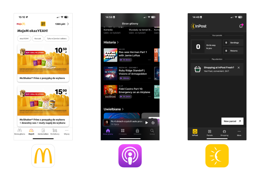
They’re packed with information, yet feel pleasant and easy to read, right?
That’s because their UI designers followed simple typography rules: such as strong contrast, no more than two fonts per page, and appropriate line-height.
Wrap-up
As you can see, a good-looking app is not a matter of luck. The look of a product comes down to many small details that need attention.
Are you working on a project and want it to look great? Or have a product that doesn’t look as good as it could?
Get in touch - we have plenty of experience and we’d be happy to help with an advice!


.svg)
SEO enthusiast with an interest in all its nuances, Oliwer is also interested in learning about various topics. Privately, he loves to play all types of sports and likes reading.

.png)

.png)


